

Paper has long been the natural medium for words, and unless you are reading this online at CityWeekly.net, that’s the way you experience this article. But paper as a medium has more to it than what commonly meets the eye, such as, textures and gradations and properties like any physical substance.
The Novel Pulp exhibit at Sam Weller’s Bookstore explores the quality of paper as an artistic medium in its physical—sometimes even sculptural—qualities, rather than its more traditional artistic use as a flat medium for printmakers to imbed their aesthetic impressions. The context of the show, using the space of a bookstore, emphasizes these uses of paper as alternative to just a blank canvas or page across which to splash verbiage.
Sam Weller’s exhibit organizer Stephanie Leitch came up with the idea for the show. “It’s a natural fit for the bookstore, with all the paper here,” she says. She has worked with paper in her own installation artworks and has long wanted to design a show at Sam Weller’s on the theme. “In every show, we want to push the limits and boundaries of the space here,” she says—and none previously has done so in quite this way. The bookstore is set to relocate at some point in the near future but has been hosting seven art exhibits a year in the meantime.
Leitch invited local artists Amber Heaton and David Wolske to participate, and they suggested Lauren Huber and Jared Steffensen as well. Heaton’s work is suspended from the ceiling, like her work as part of a group show at Kayo Gallery earlier this year. This time, her theme is site-specific, taking as its subject matter the life of the bookstore itself in the books that have “lived” there.
“It was important to me to have some part of the store represented in the physical and conceptual aspects of the piece,” Heaton explains. “I decided to use books from the bargain bins as my base paper. I cut the books apart and rebound new accordion books from the pages.” Viewers will be able to look up at it from the main floor and get a different view from the mezzanine.
Steffensen’s works take on mountainous forms rising from the ground on the bookstore’s mezzanine. “It’s a piece that’s made for the floor and to be walked around and through,“ he explains. His literalist take on paper as physical form mimics the mountainous landscape surrounding our city, as well as making an ironic statement about the impermanence of paper as material in comparison to the rocky foothills around us.
“We all approached the material in different ways,” Steffensen says. “It allows people to see the versatility of the material.”
Huber’s work—all of which was created new for this show—emerges in relief from the bookstore wall, ribbons and trophies that declare their meanings purely through their shapes. She enjoys working with paper and has been experimenting with paper cutting and small three-dimensional paper pieces a lot recently. “I’d been toying with the idea of making some work derived from the forms that awards take: ribbons, trophies, medals, plaques,” she explains. “By stripping the objects of their color and re-creating them in a utilitarian material like brown craft paper, I hope to remove some of their symbolism and power.”
“Stephanie Leitch invited me to participate after looking at my work and discussing some ideas she had for upcoming shows,” Wolske recalls. The show hit close to home for him, since he shares studio space with Ethan Ensign and Scrub Oak Bindery on the second floor of the same building, down the hall from Sam Weller’s. Bookstore owner Tony Weller has asked Scrub Oak Bindery to move along with the bookstore.
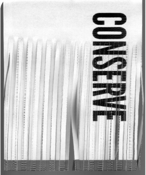
Wolske’s large pieces on the lower mezzanine are a new series of prints called “Pros and Cons,” created specifically for this show. “My reaction to the theme of the show was to investigate the dichotomy of commercial and artistic uses of paper and the rhetoric of recycling.” A sign reading “Conserve” run through a paper shredder and others among Wolske’s pieces are the only non-three-dimensional works in the show. The lack of color in his works that plays with the language and iconography of signage—as well as the transient nature of paper in the recycling process—is partly a reaction to his sense that bookstores are visually overwhelming.
These intriguing explorations of paper as medium bring it to life amid volumes in which paper serves a different purpose. “When I think of a space like Sam Weller’s, there is no escaping its history, memories, patrons, daily functions and the meaning it holds in the community,” Heaton feels. “It is as if the ghosts of those things are bound in the books.”
NOVEL PULP
Sam Weller‘s Bookstore
254 S. Main
801-328-2586
Nov. 20–Jan. 9
SamWellers.com
More by Brian Staker
-
Live Music Picks: April 12-18
Judas Priest, The Residents, Clownvis Presley, The Breeders and more.
- Apr 11, 2018
-
Loving the Alienation
Helios Creed and Chrome continue making iconoclastic music for outcasts.
- Mar 28, 2018
-
Live Music Picks: March 22-28
U.S. Girls, Ed Schrader’s Music Beat, Hell’s Belles, Columbia Jones and more.
- Mar 21, 2018
- More »
